Project brief
eRetirements is a website that help retirees and those planning for retirement to choose the best city to relocate. The website uses a quiz format to help match users to their ideal city.
Deliverables
User interviews, Competitive analysis, Customer journey map, Personas, User flow, Use cases, User testing, Visual competitive analysis, Moodboard, Style tiles,
Paper prototype, Mid-fi (Axure) wireframe, Marvel prototype
date
Date of creation of this project!September 19th 2016 - October 10th, 2016
Time: 3 weeks.
Teammates:
Natalie LeRoy
Rose Tarulo
The Challenge:
How can eRetirements provide resources for users to not only onboard but revisit the site throughout their retirement planning process and involve their communities?
Research
Being new to the market of the retirees and retirement planning, we first looked at competitors. The analysis shows that there were not many similar services to what eRetirement offers. Those services that exists are not very well-maintained and lack accuracy and organization of information. Other services cater to a more general audience, drawing sources from city and government databases. None of these services offered a customizable experience for its users.

As part of our initial research into the product, we interviewed and tested several users and potential users for this site, all either planning to retire or are already retired. The feedback we got on the initial product was mainly positive, but their skepticism for the accuracy and reliability of the quiz echoed our client’s concern that the quiz was too “Buzzfeed-ey”.
"I don't put a lot of stock into quiz results."
- a retired user

Based on our initial findings, our users are around the ages of 45-65. These users tend to use the internet for very specific purposes. For example, one gentleman said he would check on news, sports, and email a few times a day, but that’s about it. All of our users uses Google and Amazon, and have a lot of trust these sites because they are easy to use and have never failed them. Surprisingly, all our users are proliferate in Facebook and uses it as a tool to connect with friends and family. We take note that our users have special preferences, and keep that in mind as we move forward with the redesign of the website.

define
Archetypes
We find that there are two types of users who uses the site:

The Dabbler:
- Uses the site once or twice
- Fun, exploratory, minimal research
- Takes the quiz for fun
- See no need to customize profile
- Doesn’t print anything out
The Researcher:
- Uses the site often
- Compile and gather research
- Takes the quiz and takes results into retirement planning
- Will customize profile to get more accurate results
- Print out information for reference
Our goal is to convert the Dabblers into Researchers by providing the users with the necessary tools for them to use the site as an essential part of their retirement planning resources. We mapped our the Dabbler's journey as they first approach the site to take the quiz.

design principles

Feels like home:
the website echoes features that users already trust and rely on. Existing features reliably go unchanged thus creating a positive environment for user exploration

Here for you:
Website content meets specific needs and preferences of users. Information is presented without ambiguity and support is provided for users if needed.

Together we are more:
Users are able to easily share information and educate each other. They can even involve their friends and family in their planning process

Solid sources:
Information is transparently aggregated from reputable sources. Information contains clearly labeled facts from opinions to appropriately educate users with professional sources.
diverge
Now that we identified the principles for our designs, we want to come up with creative solutions that solves client’s dilemma of users not taking the quiz seriously and the user’s hesitation with the credibility of the quiz results.
Before we split up, however, we decided to categorize the solutions into four categories in order to better converge when the time came. We talked about these categories to make sure they are the best options for solving the problem. The categories are Quiz, Assessment, Profile, and Search/Filter.
Quiz
This is based on what the website already has. We wanted to test the current quiz feature against newer changes to show whether a new solution tests better. Slight changes and improvements are made to test the effectiveness of the quiz and how it compares to other solutions


Assessment
This is a tool where users can adjust each variable (i.e. Climate, Culture, Cost of Living) to get different results for their city matches.


profile
This is a page where users can view each quiz and assessment result as well as saved cities. Users can also compare their profiles with another user, such as their spouse. This feature helps the user gather and view all the important information in one place.


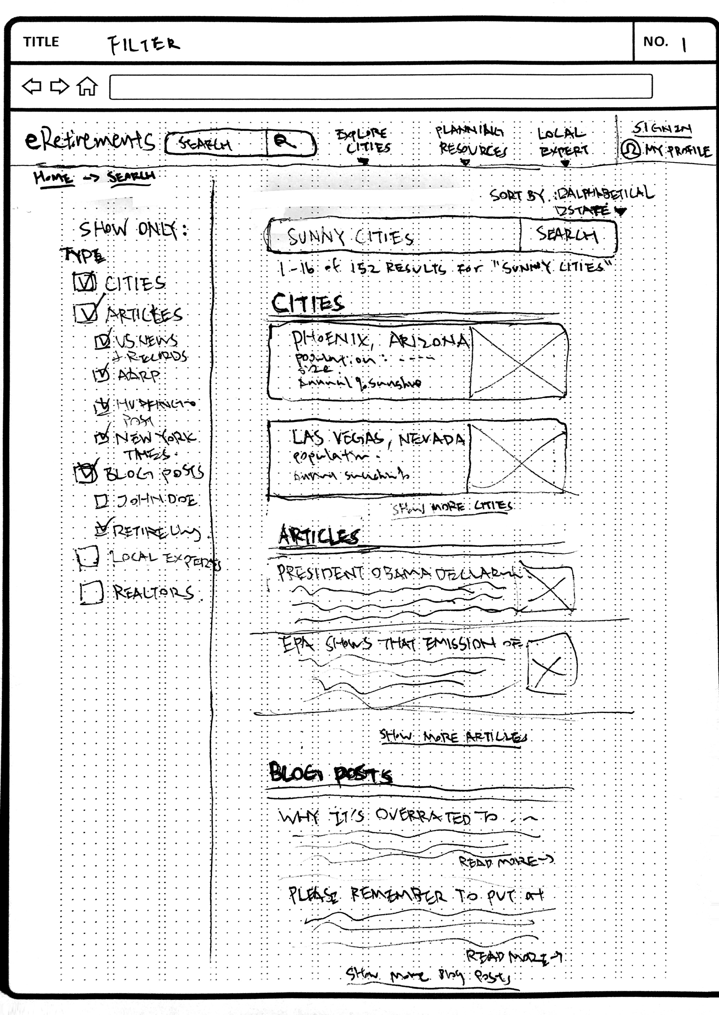
Search/filter
We added the ability to search the website to find certain cities or information on retirement, and also being able to filter the results. This will help users get to the information they need faster.

By doing so, we think it’s a more organized way of diverging when in retrospect, it limited the scope of creative solutions we could have came up with. In either case, the team collectively agree on this approach and we went forward into user testing with each of our designated concept.
concept test
From our concept tests, we remotely tested our users with each of our three prototypes. Here what we found:
1. Transparency - Users liked everything presented up front so they know what information is available to them on this site. This also includes the quiz results, where users said they like to see what factors matched them with a certain city.
2. Personalization - Users liked the ability to personalize their results with the assessment tool

"I would use this. I would recommend these versions. I think this is a step in the right direction."
- a user of the original site

converge
We decided to converge by taking the strongest aspects of each prototype that tested well and combined them into one prototype. We added all the new concepts (the self-assessment, quiz, and profile), and worked collaboratively to build a prototype that seamlessly connects those features together.
Assessment
With the assessment being one of the main features we will introduce, we put a lot of time towards making it easily accessible by the user in the converged prototype. However, in these initial mockups, the visualizations of data became too complicated for the purposes of eRetirements, and users we had tested did not respond well to large amounts of data. In our effort to present an "all-in-one" tool for the long-term user, we neglected visual simplicity and usability.


quiz
The quiz was the spotlight feature of the original eRetirements site. We kept this feature as part of our final mockup because we did not find enough evidence to eliminate it completely. Plus, our client seemed to favor the format of the quiz he has created, so we wanted to find some ways to improve upon it and have it be integrated into the new assessment feature we introduced into our solution mockups.


profile
Although there is a profile page for registered users on the current site, it consisted only of saved cities and miscellaneous information users can input like income and current location. We wanted a more robust profile where all of the user's information, cities, assessments, and quizzes can be saved and easily referred back to.


Search/filter

iterations
Because first-impressions of a website are important and has the potential to convert a Dabbler into a Researcher, we test out different home page options to see which better grabs a hold of first-time users.
To do a quick round of A/B/C test, we mocked up three different home pages:
Quiz first

Assessment first

Choose your adventure style - Quiz or Assessment

The users would then go through the flow of either taking the quiz first or the assessment, depending on which one they choose. We made it so that one feature flowed into another so it is all integrated into the final prototype.

From the results of the test, users preferred the "Assessment first" homepage because of its ability to show them immediate results with little effort from the user.
Because the assessment page was confusing for some of the users, we decided to include a walkthrough for first-time users.
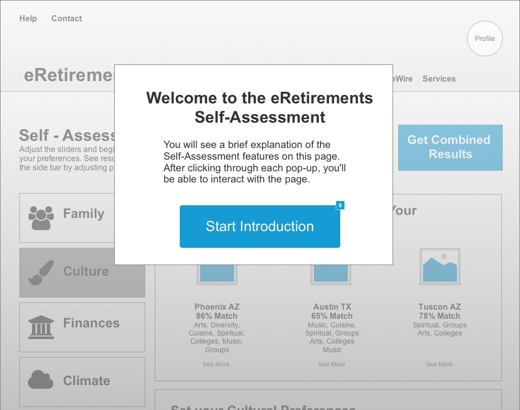

We also made the assessment categories left aligning rather than put on top since it gave more breathing room to the overall layout of the wireframe.

final thoughts
There were parts we could have diverged more but for fear of trouble converging later on down the road, we converged and agreed upon what the solutions are at the point in the design process where it is beneficial, crucial even, to diverge.
future considerations
However, through this experience I learned the importance of diverging and converging at the appropriate time. More importantly, I realize that proper communication between team members could have avoided the problem. I have gained much insight from this project, and I take these valuable lesson with me into my future projects.
 Click to see the final prototype!
